

Erika Hornmark
A content writer at aboveA, passionate about crafting impactful stories that connect with audiences. Studying political economy and statistics at UC Berkeley, I blend analytical insight with creative storytelling to help businesses grow and connect with their audience.
Landing Pages Best Practices You Must Know
- Last Time Updated: June 15th, 2026
Landing page performance has got you worried? You’re not alone. If you’re struggling to convert casual site visitors into leads or sales, you’ll need a landing page that performs well. Landing pages are an often overlooked–but incredibly powerful–tool for marketing.
In this guide ,we’ll go step-by-step to help you build your best landing page. This practice guide covers everything from design tips to examples of successful landing pages. An ideal landing page will fit your goals, drive quality traffic, and capture customer attention at first glance. Regardless of your business model (e.g., B2B, B2C, service-based, or ecommerce store), our landing page advice will help you optimize your page for maximum conversions.
Don’t know how to start building a landing page?
Create an optimized landing page to drive traffic and conversions.
Table of Contents
What is a Landing Page?
Landing pages are standalone pages calling attention to a specific call to action (CTA). They’re created specifically for marketing or advertising campaigns. Usually, a site visitor will arrive at a landing page after clicking a link on an ad, a social media post, or an email. Landing pages are effective because they remove distractions, and are designed with a single goal of converting visitors into leads or loyal customers.
CTAs on landing pages may ask visitors to download a free guide, make a purchase, drop their email, or sign up for a newsletter. An optimized landing page guides them towards the action.
So, what do optimized landing pages look like? In general, they will load fast, have a minimal, clean theme, and, most importantly, communicate the CTA. The page should have a clear value proposition that follows the CTA showing what site visitors can receive in return for the preset action.
How a Homepage Differs From a Landing Page
A common misconception when building websites is that a landing page is the same as a homepage. They serve different purposes and have different formats and conversion rates. A home page is usually the first thing a site visitor will see. It serves to introduce your business and gives visitors several options as to what to see, what’s on offer, and navigate towards. On the other hand, a landing page is specifically built to communicate a CTA and convert visitors into leads.
Homepage | Landing page | |
Purpose | To welcome new visitors and introduce your business | To drive a specific, pre-set action |
Format | Can navigate through the full site menu | Typically will have no navigation menu |
Audience | Broad, for all first-time visitors | Narrow, ideally campaign-specific, and filtered beforehand |
Conversion Rates | Lower | Higher (if done well!) |
Essential Components of a High-Performing Landing Page
Landing pages, while simple in purpose, can be deceivingly hard to put together. To build an effective, high-converting landing page, you’ll need more than just a pretty design and catchy headline. The elements should be thoughtfully put together and cohesive to properly guide visitors towards the desired action. Must-have elements that every top landing page will have include punchy headlines, attention-grabbing images, platform adaptability, and more.
Create headlines that grab attention fast
Your headline is your business’ first impression. To be effective, it must compel visitors to stay on your site. From reading the headline, customers should be able to immediately gauge the offer and why they should care. Keeping the headline clear and to the point will keep readers from getting confused. Examples of an easy-to-read, action-oriented headline include “Boost Your Sales in One Week” or “Get 50% Off on Women’s Clothes Now.”

Keep your message short and on-point
Nobody will read long paragraphs on a landing page, so your landing page shouldn’t have too many moving parts. Using simple, scannable formatting, like bullet points, bolding, and plain language will communicate your message without distracting your reader. Focus on the benefits over the features and use subheadings to make your messaging more digestible.
Some great tools that can help you make your writing more concise include Hemingway and Grammarly. Hemingway is great not only to check grammar, but gives you a gauge on how difficult your text is to read. It can help rewrite your text to be more cohesive and easy to follow for your intended audience. Grammarly is great for checking grammar, flow, and can give additional suggestions to polish up your work.
Guide users with a powerful CTA
Your design should center around the CTA. CTAs serve as a final push for your reader. Draw attention to it with contrasting colors and strong verbs. Clear, short, and visible CTAs will drive the most conversions out of everything else on your landing page.

Both the Monday.com and SquareSpace landing pages show a basic setup of a clear headline, a byline with their value proposition, then a strong CTA in a button-form that your eyes are immediately drawn to because of their different color.
Make forms easy and efficient to fill
When creating your form, avoid asking for too much. Sticking to the essentials increases the likelihood you’ll get full responses. For example, when asking for contact information, only ask for name and email unless more data is absolutely necessary. Consider enabling autofill features and progress indicators to make the process feel seamless.

Use sharp images that support your message
Visuals should only complement the written content, not distract from it. Using high-quality custom graphics and product previews can help boost engagement. One tip is to avoid stock images on your website – it reduces authenticity and can negatively impact trust in your brand.
While custom graphics are always the best way to go, if your topic is very niche or lacks more commercial options, another route you can take is exploring generative AI images. Tools that can help you tap into this space include Google Gemini, Midjourney, and OpenAI’s Dall-E 3.

The Apple landing page shows their iPhones in a sleek and modern manner that reflects the ethos of the company and its design principles. It’s sharp, eye-catching, and complements the branding.
Add reviews and badges to build trust

Not only does the Notion landing page have a great, on-brand creative image that aligns with its brand, it’s also a great example of adding trust signals. As a website and workspace builder, displaying well-known brands that use their product may boost favorability with readers familiar with them.
Make sure your page looks great on phones
Over half of web traffic is mobile. A responsive or adaptive landing page design is a must for web performance and SEO. Retaining similar ease of navigation, reducing load times, and testing across devices can help maximize conversions.
As a starting point, consider the following on your checklist:
- Responsive design: how does your website adjust to the change in screen size? Does the text run off screen?
- Fast load times: in general, anything above a 10 second load time on mobile data is too long. Shoot for about three seconds.
- Clear navigation: is it easy to navigate with your fingers, or are the buttons too small and hard to read?
- Optimized images: are images properly sized without losing too much quality?
- Across devices: how does your website show up on iOS, Android, and other devices?
Which Landing Page Type Fits Your Goal Best?
Landing pages are also called “lead capture pages,” “squeeze pages,” and “lead gen pages.” These specialized pages are most effective when optimized around a single CTA. We’ll dive into the two key types of landing pages to know when constructing your website.
Lead generation landing pages
Lead generation landing pages have one goal: collecting contact information from visitors. In order to motivate users to provide data, most lead generation landing pages will offer something valuable, a lead magnet, in return. Lead magnets can look like free trials, exclusive white papers, or eBooks. They can also be forms of gated content which can be unlocked through payment or release of some customer data. Other interactive lead magnets include personalized calculators (type in this information and you can get a personalized quote), quizzes, or demo versions of paid services. In any case, make sure lead magnets are relevant to your business. These types of landing pages are ideal for B2B businesses and building email lists.

The Airbnb landing page works because it’s a personalized calculator for potential customers to see what Airbnb can do for them.
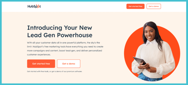
The HubSpot landing page for a lead generation tool is straightforward, eye-catching in design, and clearly funnels readers to getting a demo of premium software or starting with a free trial.
Click-through landing pages
On the other hand, click-through landing pages work by warming up users before sending them to a purchase, form, or sign-up. Instead of forms, they use a clear CTA button that moves them to the next step.
This type of landing page is best for ecommerce and free trials because they reduce friction in the commitment process. One other example of companies that can benefit from click-through landing pages include SaaS or product-based companies offering free, basic, and pro plans. Click through landing pages provide context that make customers more comfortable to progress to the next step.

The Shopify page works by showing past clientele, offering a free trial, using streamlined point-based formatting to show the benefits of using Shopify. Finally, the page funnels into the collection of email data to start a free trial with the website.
Steps to Building a Landing Page That Delivers
Though deceptively simple, a high-converting landing page requires lots of planning. If you’re intent on turning your landing page into a conversion machine, following this step-by-step guide to building a landing page will look fantastic on your website and perform fantastically with your readers.
Choose tools built just for landing pages
If you’re starting from scratch, a great starting point are landing page builders. User-friendly tools like Unbounce, Instapage, and Hubspot can generate simple and clean landing page templates. Elementor is another tool that can help you build and test pages without having a robust coding background.
So, why should you use specialized landing page builder tools?
- They’ve already done research and have created conversion-optimized templates
- You can easily compare page variations to see which one works for you
- Easily integrated with CRM and email platforms
- If you lack a coding background, they’ve also sorted out technical problems. For example, a lot of the page loading time has been pre-optimized.
Use templates to speed up your launch
Pre-built landing page templates are great for getting your site live in the shortest amount of time. Especially if you have less experience with websites, templates are typically built with specifications in mind. They’re usually already mobile-responsive, run through user testing, and designed to be visually appealing.
Even if you use a pre-built template, it doesn’t mean you have to keep all the features the same. Customizing with brand colors, CTAs, and brand-specific messaging transform a template into your landing page. Avoid overcomplicating the landing page. The most effective landing pages aren’t complex, they’re clear and cohesive with brand identity.
Unsure of where to start? Consider exploring these platforms:
- Canva: provides a wealth of designs for your landing pages, often designed with mobile-friendly usage in mind. Template options can be expanded with paid options.
- Wix: super navigable and built for beginners. Comes with a range of pre-made landing pages that use drag-and-drop functionality. Includes both free and paid templates.
- Unbounce: great for experienced marketers. Offers higher-tech testing and conversion analytics. Templates only included with a paid plan.
- Webflow: templates on Webflow are highly professional, visually striking, and while somewhat harder to set up compared to Canva or Wix, can be learned quickly. The platform offers more room for customization. Offers both free and paid templates.
Connect your page to a running campaign
Landing pages work best when connected to a larger campaign. Campaigns can be communicated with email lists, Facebook, or Google. Regardless of platform, the landing page must match the campaign’s promise, focus, and design. The landing page will ideally funnel into these campaigns.
Always design for your specific audience
No matter what you’re selling, your landing page should be built around your ideal customer profile. A great landing page will speak to their pain points, their industry, and what they are looking for in a product. The headline, the CTA, and landing page design should be cohesive and never leave readers confused about where the page is going next. Building around your ideal customer profile increases the likelihood you reach viable leads that you can bring into the next stage of your funnel.
B2B | B2C |
Focus on rational decisions. Providing information on expected ROI, efficiency increases, and long-term value. | Readers can be more easily swayed with references to emotions, lifestyles, and convenience. |
The value proposition should be front and center. | Headlines may focus more on a feeling or desire. |
CTAs might focus more on demos, free trials, or one-off consultations. | CTAs benefit from more urgency. Use words like ‘get your quiz results now’ or ‘join today.’ |
Using industry terminology and creating social proof badges, reviews, and testimonials from similar clients can help build trust. | Social proof may be more effective as reviews from influencers or other customers. |
Smart Ways to Send Visitors to Your Page
Once your landing page is finally live, the next step is generating traffic. Here’s how to start sending web users to your digital entry point.
Bring in clicks through paid ads
Paid ads are often the simplest and fastest way to generate traffic for your website. Platforms like Facebook, Google Ads, and LinkedIn are great starting points to target your ideal customer profile and start scaling up your online traffic.
Confused on where to start with paid ads? Some basic tips for getting started with Google Ads include crafting a strong, cohesive headline, aligning your keywords with your value proposition, and planning your landing pages ahead of time. As an example, a thought-out landing page linked to a specific Google Ad campaign will likely outperform a generic web page.
Use email blasts to lead people in
Email lists are another effective marketing tool. Segmenting your email list and offering personalized touches to your communication can funnel them towards a tailored landing page. The landing page should match your email’s language and offer. By leading them directly to what your customers might want to see, you can achieve higher conversion rates.
Boost visits through SEO and keywords
Optimizing your landing pages for SEO is another fantastic way to tap into organic reach. Making sure to clearly mark headings, adding concise and relevant meta descriptions, and infusing industry-specific keywords into your title can help give your landing page the push it needs.
What other traffic sources can boost your page?
Beyond ads, email, and SEO, other effective traffic sources include:
- Social media presence (not only posts, but also comments)
- Online influencer partnerships
- Webinars and in-person events
- Gated content
- Online forums (Reddit, Discord)
- Shareable resources on Notion
If implemented in a way that segments by interest and demographic, the channels can help drive quality traffic to your website landing page.
Isn’t paying for more traffic easier?
It might seem easiest to relegate your outreach to paid ads. In some cases, it can be just as effective. But in order to maximize your return on investment, combining landing page optimization with a smart traffic strategy can be the best way to boost your conversion rates. Using both strategies will help you convert and sell while generating a pipeline of quality traffic and leads.
How Landing Pages Stand Out From Regular Pages
Landing pages stand out from regular pages because the content is highly specific and campaign-specific. The design solely revolves around driving a predetermined action. It should be eye-catching and persuasive, and be less about providing information and more about pushing an end result.
What a landing page is really meant to do
The purpose of a landing page is conversion. It’s meant to spur a form sign-up, a purchase, or download. There should be one clear goal. Homepages, for example, can look very different because they juggle multiple links, may have many visuals and written content, and have many distractions that a customer may have to navigate through.
Why can’t standard pages convert like landing pages
A regular web page will have many other navigational elements (think menus, side-bars, interactive pop-ups). While this is great for finding more information and browsing freely, it can be difficult to turn those elements into conversion. A great landing page will remove any friction in the process. It’s centered around a single message and pushes just one CTA.
The power of a page with just one goal
The laser focus on this one goal, conversion, is what makes landing pages so powerful. In fact, websites with 10-15 landing pages get roughly 55% more leads than websites with fewer than 10 landing pages.
Tips to Create Landing Pages That Convert
Now that you understand the benefits to having landing pages on your website, here’s some tips to make them more effective so you’re able to convert more effectively. These tips can help you move from a good landing page to a great landing page!
Know the main goal before you start building
Your design choices should reflect your one goal. Before opening your landing page builder, start by asking yourself: what do I want my site visitor to do? Starting with a CTA creates clarity that can be a great guide to shaping your page.
Speak directly to your ideal visitors
High-converting landing pages shouldn’t function like a billboard. Make sure that you use second-person perspective (i.e. “You”) and focus on the benefits of your product or service that can help address the reader’s pain points.
Make your offer hard to ignore
Think from your site visitor’s perspectives. They’re often looking at a site wondering “what’s in it for me?”
Starting from this question can help you refine your value proposition. The value proposition should be crystal clear and concise. Visually, it should stand out – using bold text, strong visuals, and social proof can help massively with that.
Design with the visitor journey in mind
Don’t just start by throwing content on a landing page and seeing what sticks. Structure and intention matter. An example of an optimal landing page structure that can help serve as a starting point include:
- An eye-catching header
- A byline that concisely offers your value proposition
- An image or video (in fact, adding videos to your landing page can boost conversion by up to 86%)
- Choice between bullet point benefits or features and social proof
- Your CTA

Test, tweak, and improve your page often
Your landing page is never done. Consumer sentiment and industry trends change all the time, and your landing pages should reflect that. Using A/B testing for landing pages can identify inefficiencies in your headings, your button texts, and even the layout of your landing page. Landing page optimization tools can also help you streamline the components of your landing pages for a smoother user experience.
Takeaway
A great landing page isn’t just about being visually appealing. It incorporates consumer psychology, optimization tools, and intention to drive your visitors towards your CTA. Whether you’re using free landing page templates or building custom designs, your starting point should always be your one goal.
Make sure to use your landing page to ‘talk’ directly to your audience. Continuously testing and re-optimizing your site will keep results coming. Apply these best landing page practices and see your web traffic convert faster than it ever has before.
Frequently Asked Questions
1. What’s the main purpose of a landing page?
Any landing page should be built to convert. It converts visitors into leads that have participated in one specific action (a CTA). The CTA can be downloading a guide, filling out a form, signing up for a newsletter, or making a purchase. Being focused on the CTA helps to increase conversion by removing distractions and navigation, and guiding visitors towards conversion.
2. How is a landing page different from a homepage?
Homepages are busy and built with the intention to provide as much information as possible. They’re typically filled with navigational elements, links, and media. This couldn’t be further from landing pages, which have one goal (conversion), are built around a single CTA, and remove navigational clutter.
3. What’s the most important element on a landing page?
The CTA is the most crucial element of your landing page. It tells visitors what you want them to do next. An effective CTA will be concise, convincing, and exceedingly easy to locate.
4. Do I need a separate landing page for each campaign?
Yes. Each landing page should reflect a specific campaign. In fact, websites tend to gain more traffic and convert better with a greater number of specific landing pages. This ensures that the content matches the visitor’s needs, improves relevance, and thus contributes to a higher conversion rate.