
How Does Conversion-Focused Design Impact Sales?
Conversion-focused design drives real growth in sales by guiding users towards specific actions like buying, signing up, or clicking. It does this by using layout, colour, structure, and user experience elements that keep a visitor interested and make it easy for them to convert into a customer.
When a website looks confusing or hard to navigate, people are quick to leave. But when it’s clean, simple, and clearly shows the benefits of a product or service, sales go up. That’s what conversion-focused design is all about – it turns traffic into action.
So, What Is Conversion-Focused Design?
Conversion-focus design (CFD) is a way of designing a website or landing page with one big goal: getting users to take action. This could be buying a product, signing up for a normal newsletter, or clicking a “book now” button. Unlike normal design, which may focus only on looking good, CFD mixes looks with strategy.
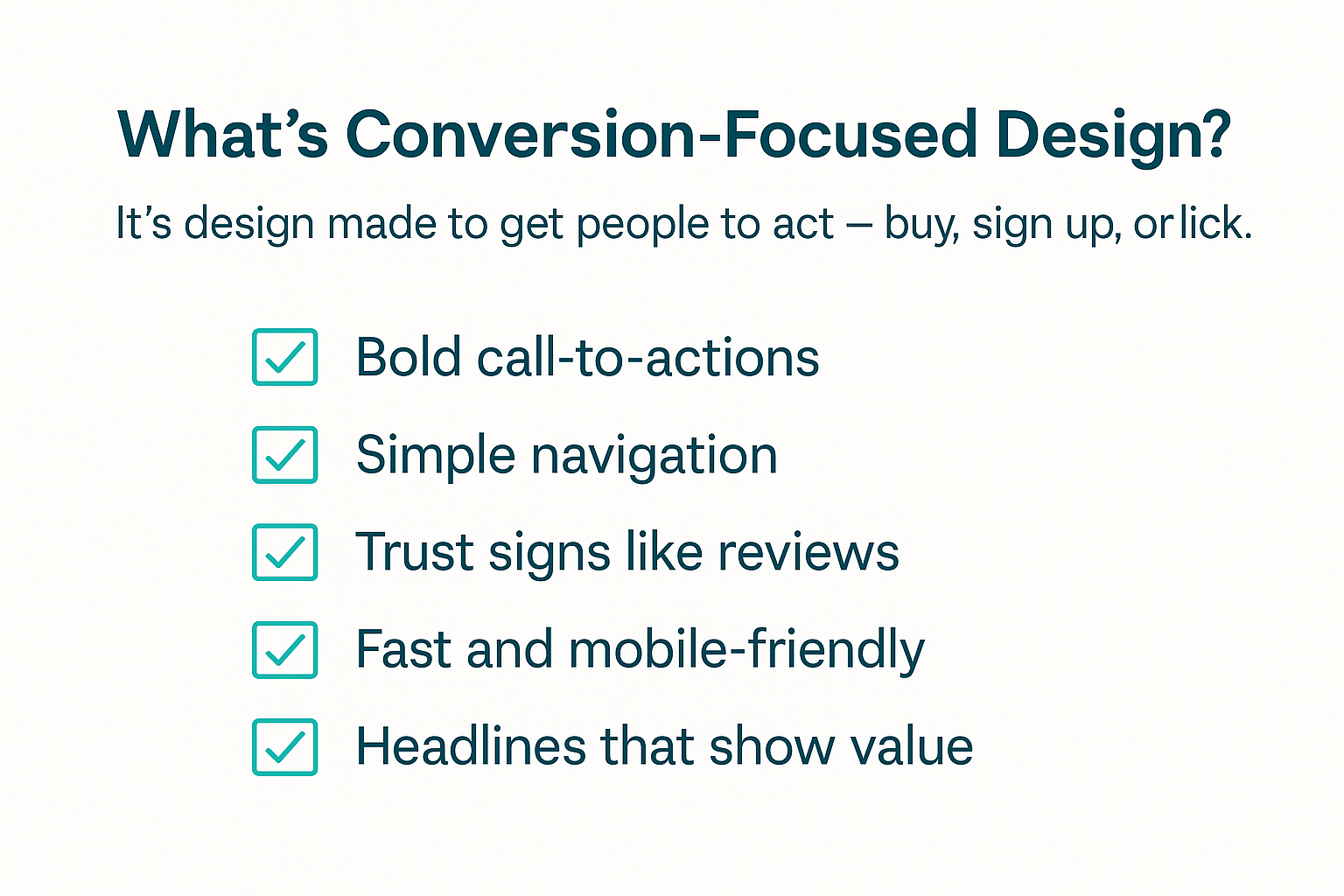
CFD highlights these factors:
- A clear and bold CTA, such as “Buy Now” or “Get Your Free Trial”.
- A simplified site navigation so visitors don’t get lost.
- Have reviews, testimonials, or security badges so it looks more trustworthy.
- Have fast loading speeds and mobile-friendly layouts.
- Having engaging headlines that solve a pain point or show value.
Why CFDs Matter when it comes to Sales?
Think about this. Have you ever clicked on a website and left right away? Yep, me too. That’s why conversion-focused design is so important. Google says people make up their mind about your site in only 50 milliseconds. That’s like…less than a blink of an eye! So, your site needs to shine right from the start. Here’s a chart that shows the typical user journey on a conversion-optimized site.
What Happens | What The User Does | Why It Matters |
|---|---|---|
Lands on Homepage | Sees a helpful message or a bold headline | Gets curious and keeps scrolling |
Scrolls Around | Find benefits, reviews, and images | Starts to trust your brand |
Clicks CTA | “Buy Now” or “Get Free Demo” | Takes the action = you get a sale |
Confirmation Page | A simple thank you or upsell page appears | Keeps the customer happy and engaged |
What Makes a Design Convert Better?
Okay, so not all websites work well, even if they look good. The truth is: a beautiful site that’s hard to use won’t help you sell anything. In fact, many pretty websites don’t sell at all. However, there is a way to solve that :
Have strong headlines that say something
Let the people know what they’re getting right from the start. For example, “Get a brighter smile in just 3 days” is better than “our whitening kit”.
Visual Hierarchy
This just means that the important stuff, like headlines, CTAs, buttons, and images, should be big and bold. Don’t hide your best info!
Colours That Guide People
Colours matter. Red buttons can create urgency, while blue feels calm and trustworthy. It all comes down to whether you want them to trust you or you want to urge them to buy your product or services.
Colours That Guide People
Most visitors come from mobile devices. If your site looks broken on a phone? Say goodbye to those conversions. I’d always suggest doing A/B testing. This means trying out two different versions of a page to see which performs better. Small changes like a button colour or a new headline can make a big difference.
Examples of conversion-focused pages that work.
Let’s have a look at how big businesses do it. And how can we learn from them?
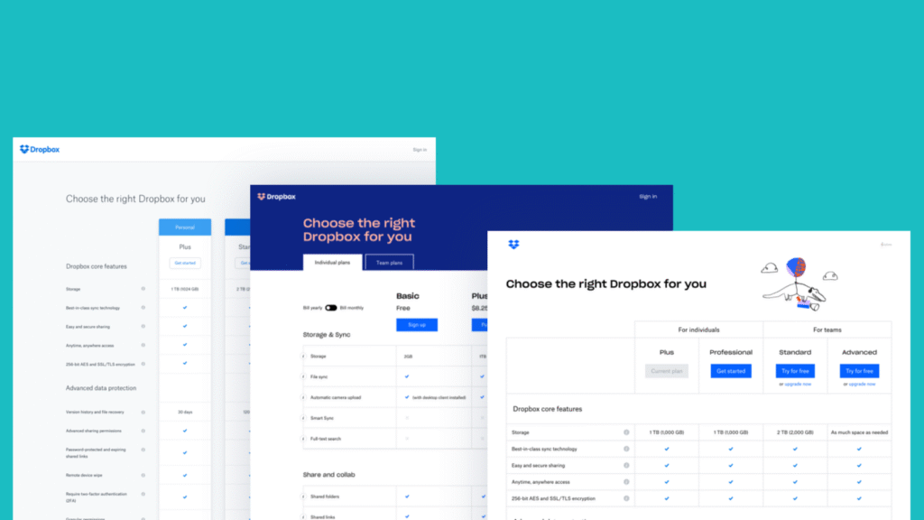
Dropbox
Dropbox has a clear and focused approach. Their homepage is super clean with one message and simple buttons. Simple yet powerful.
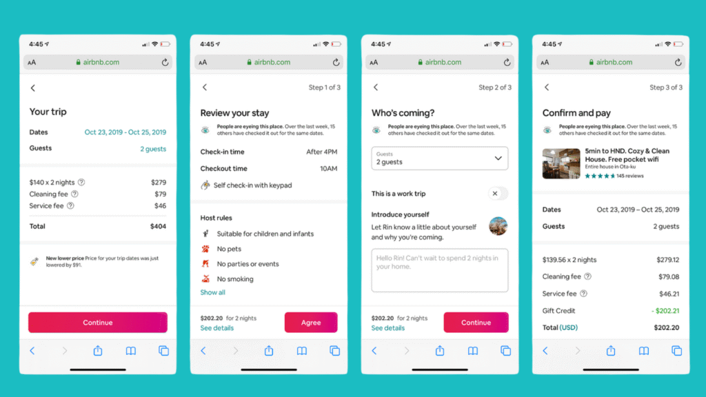
Airbnb
Dropbox has a clear and focused approach. Their homepage is super clean with one message and simple buttons. Simple yet powerful.
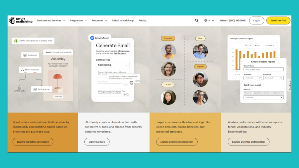
Mailchimp
Mailchimp uses many bright colours and lots of white space. This attracts the attention of site visitors. Their bold CTAs also make it easy to generate leads because it is convenient for potential clients to sign up.
How it Connects with SEO and UX
Here’s the cool part: conversion-focused design doesn’t just help sales. It also helps your SEO and user experience (UX).
Google loves pages that:
- Load fast
- Are easy to use
- Make people stay longer
- Work great on phones
- Have a clear structure
By focusing on conversions, you naturally check off many of these boxes. So yes, a great layout can help both traffic and sales.
You can explore content marketing with aboveA team for further details when it comes to SEO best practices and how to build a high-converting landing page.
Want our experts to examine your conversion rate bottlenecks?
How to Start Using Conversion-Focused Design
You don’t need a huge budget to begin. Just focus on these basics:
- Know your goal: what do you want users to do? buy? Subscribe? Call you?
- Focus your message: make sure your headline talks about your user’s problem, not just your product
- Keep it clean: use while space and avoid too many pop-ups or animations
- Use high-quality visuals: stock photos work if chosen well, but real images are better.
- Test and improve: try different layouts, colours, or CTAs text and see what works best.
Final Thoughts
Conversion-focused design is not just about looking nice, it’s about making users act. It all comes down to using clean layouts, smart CTAs, and focusing on the user’s needs, you can increase sales without needing more traffic.
I would always recommend starting simple: write one strong headline, place a clear button, and add a testimonial. That alone can move the needle. Design is powerful. Don’t only have great visuals, mix in some impactful strategy as well. You don’t just want to get attention. You want action!
Meet the Author

Teerisra Donlunwad
She is our talented content marketing specialist from Thailand. Currently in her senior year studying marketing, she supports projects like the aboveA Academy and weekly TikTok content. Her creativity and dedication shine through each video, making her a key team member driving fresh, engaging content every week.